Design Principles - Exercises
Week One - Three (04/1/2022- 20/1/2022)
Lean See Phing |0353393
Design Principle| Bachelor of Design (Hons) in Creative Media
Exercises

|
| Fig 1.0: Thumbnail |
Instruction
Exercises
1. Gestalt theory
Honestly, I think it's amazing when I'm studying the theory that's applied to the kinds of design that I really admire and the most enticing part is "different perception from different individuals when looking at the same picture". Therefore, I'll challenge myself to create a gestalt theory design.
# Week 1
In week one, I got inspired and did some visual research based on the gestalt theory (figure-ground), found a few references, and sketched up a few designs.
Definition
Gestalt theory, also known as gestalt psychology, suggests that we do not simply focus on every small element. Instead, our minds tend to perceive objects as part of a greater whole and as elements of more complex systems (Cherry, 2021.)
Whereas, figure-ground perception refers to the tendency of the visual system to simplify a scene into the main object that we are looking at (the figure) and everything else that forms the background (or ground) (Cherry, 2020.)
Process
(i) Inspiration
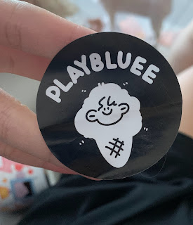
At the very beginning, I came up with the idea for my design from a sticker that was put on my parcel from Taobao (A China online purchasing app). I was surprised when I saw the sticker because I believe the seller is employing a cute way to create a figure-ground with her face as well as cute ice cream. As a result, I opted to go with the ice cream form while adding other elements.

|
| Fig 1.1: Taobao sticker |
(b) Visual Research
After that, I started searching the Internet and Pinterest for some references to help me come up with further design ideas after I made my pick. The gestalt theory art associated with ice cream can be considered to be zero. I only discovered one that attracted my attention because of the smooth flow of the entire ice cream shape and the unexpected representation of a cat on top.

|
| Fig 1.2: Figure-ground of ice cream combined with a cat. |
(c) Roughly sketch
Before I start sketching, I try to look up several ice cream shapes on Google, then I went with this, which has three scopes of ice cream that I can depict as an unhealthy body form and a long cone that can also represent a human leg.

|
| Fig 1.5: references of ice cream. |
In my sketch, I used the same method as in fig 1.2 (ice cream with a cat head on top of it) to include the unhealthy body shape lady into the ice cream. To influence people's perceptions, I sketched a complete ice cream form on the left and a lady with an unhealthy body shape that is comparable to the ice cream shape on the right.

|
| Fig 1.6: Rough sketch |
In order to assure the visual quality of the design, which I believe must be extremely smooth, I opted to make this design digitally.
(d) Drawing process
After the rough sketch, the initial digital drawing grew a little bit clearer and smoother, but there is still a lot of room for improvement.

|
| Fig 1.7: Initial drawing |

|
| Fig 1.8: First outcome |
This is already in the middle of my process, and I really like how it looks now because I can clearly see what I'm trying to convey to the audience, and I believe the two different things on each side can definitely manipulate audience perception.
(e) Receiving feedbacks
However, I believe it is more necessary for me to remain objective with my own work in order for it to progress to a better stage. I then sent my work to a few of my friends to get their thoughts on what they saw in the photo.
Comments from my friends:
- An ice cream at first
- A fat lady or man at second
- A fat lady who is dancing ballet
- I thought there are some flaws with the cherry, now only I know is a head.
This feedbacks indicates that I did what I wanted but not in a very clear manner, so I'll have to improve it.
# Week 2
In week 2, I mainly focused on how to improve it by referring to Dr. Charles's opinions as well as my friends‘ feedbacks.
(e) Improvement (cont'd)
After finishing my first outcome, I presented Dr. Charles with some advice since I was unsure whether I was doing this right because there were much feedbacks on my work.
Following Dr. Charles' comments, I now have a good understanding of the main parts where I need to improve.
(i) Ice cream shape (left side)
People can notice ice cream in the design because it has a cone on it which helped people recognize it as ice cream, but without it, the ice cream would fail. So, I decided to revise it to make it plumper and show an ice cream shape more clearly.

|
| Fig 1.9: Comparison between before and after (ice cream) |
(ii) Unhealthy body shape (right side)
The unhealthy body shape is not clear; it doesn't really appear as a human with a large tummy, which is really unhealthy; there are some parts that appear flat and some parts that appear odd. As a result, I made some improvements in that part as well.

|
| Fig 1.10: Comparison between before and after (body shape) |
(iii) Face
The face is the main part that allows people to recognize the right side as a body, so if the face isn't drawn well, people would mistake it as melting ice cream.
I studied this image properly and noticed that the artist drew the face very clearly, which I think I should try on.

|
| Fig 1.11: Reference of the face. |
The revised version has a pleasing appearance, which surprised me because I had expected the ice cream shape will weaken as I drew the face in a clear way. Anyway, I think this design is great.

|
| Fig 1.12:Comparison of before and after (face) |
Final outcome
Named: Healthy over sweets
_
Meaning
Overeating in sugary snacks has long been shown to result in an unhealthy body shape. Severely, it can even lead to additional health problems.
As a result, with this design, I'm attempting to link ice cream, which represents sugary treats, to unhealthy body shapes. Furthermore, I hope it serves as a caution to everyone to be aware of the effects of eating sugary snacks.
_
Feedback:
I completely get what you're trying to say with this design after hearing you explain it but not before you explain it. My advice is to make it more perceivable by drawing the line, and profile of the face, as well as the unhealthy belly clearly to demonstrate what you want to say. Overall, nice job; the cone is very clear, so I can see ice cream.
_
Reflection:
In this first exercise, I realized how cautious we must be in order to convey precise information to audiences. All of the improvements I've made are mistakes I shouldn't have done in the beginning, but I wasn't aware of it; I drew what I wanted and assumed it was great because I knew what I was trying to express.
Furthermore, I've learned to only delete the useless elements and only emphasize the main and simple elements after listening to Dr. Charles' feedback on my classmates' gestalt theory work. Gestalt theory isn't appropriate for complex elements or design because its main point is to manipulate others' perception. Complicated will result in communication failure.
_
References
Cherry, K., 2020. How Figure-Ground Perception Helps Us Distinguish Scenes. [online] Verywell Mind. Available at: https://www.verywellmind.com/what-is-figure-ground-perception-2795195 [Accessed 15 January 2022].
Cherry, K., 2021. What Is the Gestalt Approach In Psychology?. [online] Verywell Mind. Available at: <https://www.verywellmind.com/what-is-gestalt-psychology-2795808> [Accessed 5 August 2021].
2. Repetition
# Week 1
I basically spent all of my time thinking about what principles I should do, and do some visual research to come up with an idea, but I still couldn't make a decision.
# Week 2
After getting inspired in week 2, I began sketching a few designs, did a lot of visual research and improvements, and discovered a few references depending on what I desired.
Definition
Repetition is simply repeating a single element many times in a design. For example, you could draw a line horizontally and then draw several others next to it (Soegaard, 2021.)
There is a variety of ways in which repetition in art can occur. It can be even or uneven, regular or irregular, it can form radiation, occurring when the repeat of elements is spread out from the central point (P., V. and Kordic, n.d.)
Process
(i) Inspiration
Maizatul, one of my classmates, was the one who inspired me. Perhaps we're both having the same experience in that we're not from a design-related field, which makes us feel insecure. So, I pay close attention to the work she presented in class. The random line and vivid colors of her work drew me in and motivated me to sketch at random to come up with an idea.
As I sketched randomly, I created something that I found funny but creative, which re-inspired me. I decided to create a design by combining the man I drew repetitively with the theme of three main races in Malaysia.

|
| Fig 2.0: My random draw that re-inspired me |
(ii) Drawing process
This is the initial sketch, which is roughly similar to the first random draw.

|
| Fig 2.1: Initial sketch |
Honestly, I dislike this work, but I was stuck there because I'm not sure how varied all of these elements can be, so I'm afraid that I'll run out of the repetition topic. As a result, I decided to show Dr. Charles in order to obtain some feedback.

|
| Fig 2.2: Three mans making process |
(iii) Receiving feedbacks
Dr. Charles raised a number of questions and doubts regarding my work.
- Why they aren't with heads?
- Where are their hands?
- Why are they bare feet?
- What is the foot hair means?
Meanwhile, I told Dr. Charles of my worries. He also showed and explained an example to me as well as advised me to aware of the common repetitive element of the culture/ common repetitive dissimilar object.
Particularly, do a bit more research.

|
| Fig 2.3: Example given by Dr. Charles |
(iv) Visual Research
Therefore, rather than confining myself to what I wanted to draw originally, I chose to undertake more visual research to gain new ideas.
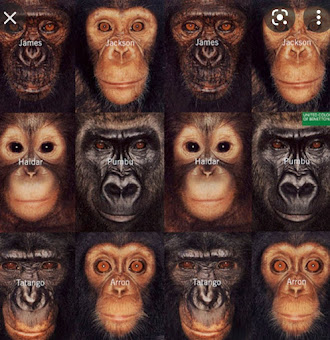
I finally set my eyes on this after various references, they are all in different colors and positions but appear to be similar.

|
| Fig 2.4: References of repetition #1 |
This example surprised me as well because of its dissimilar yet similar elements. Then I have an idea to completely overhaul the drawing style.

|
| Fig 2.5: References of repetition #2 |
(v) Drawing process (cont'd)
I drew and colored three men with different elements (hair, clothes, skin color) according to their races to show dissimilar elements but remain the same with the whole body shape, face, emotion, etc.

|
| Fig 2.6: Three mans making process (revised ver.) #1 |

|
|
Fig 2.7: Three men making process (revised ver.) #2 |
Until this (Fig 2.7), I think it overall seems much better than the previous work, but still appears to be empty, so I decided to add a background color and the word "Malaysia" in gradient into the background.

|
| Fig 2.8: First outcome |
(vi) Improvement
After I finished my first outcome, I showed it to Dr. Charles again, and he was pleased and said "Good job," but he still gave me some suggestions on how to develop it to a higher level.
To enhance the repetition, I first change the preset to landscape and move the three males to both the left and right sides.

|
| Fig 2.9: Malaysia family making process #1 |
However, I find it boring to copy and paste the same thing again, so I changed the left three males to three females.

|
| Fig 2.10: Malaysia family making process #2 |

|
| Fig 2.11: Malaysia family making process #3 |
It now looks pretty great, with different elements from three races while being similar at the same time, in my opinion. Then, I also fill in the background with the word "Malaysia," making both the text and the orange background lighter.
Final Outcome
Named: Tiga bangsa, Satu Keluarga

|
| Fig 2.12: Final outcome |
_
Meaning
In this design, I'm attempting to bring forth the three major races in Malaysia and unite them together, as in the title of this piece, "Tiga Bangsa, Satu Negara." We are still family, even if we are from three different races, as long as we are in Malaysia, our home.
_
Feedback
Good! More will be nice! Make it a row, the repetitive pattern will be more obvious. However, the current orange background is a bit too strong, soften it up a bit with a light texture or pattern. The "Malaysia" background is interesting, it will be good if you can fill the whole background with a lighter yellow.
_
Reflection
I finally comprehended how repetition works and what variety there is in repetition by working on this exercise in which I employed repetition. I used to question that if I drew different components according to the races, it could actually be repeated patterns. The end result proves to me that sure, it is possible.
At the same time, I discovered how important it is to conduct visual research before creating any design so that we can discover a lot of different designs with the same topic. I used to believe that repetition meant gathering all of the same things together, but after conducting some visual research, I believe that it's more than just copying and pasting the same thing; it's fascinating in its own right.
More than that, I've realized that people tend to confine themselves by the boundaries they create for themselves; nevertheless, we are the only ones who can break them, so we should broaden our horizons and try new things, just as I no longer obsess over my first drawing.
_
References
P., S., V., A. and Kordic, A., n.d. Repetition in Art - To Be Exactly the Same Over and Over Again | Widewalls. [online] Widewalls. Available at: https://www.widewalls.ch/magazine/repetition-in-art-artists-photography [Accessed 16 January 2022].
Soegaard, M., 2021. Repetition, Pattern, and Rhythm. [online] The
Interaction Design Foundation. Available at:
<https://www.interaction-design.org/literature/article/repetition-pattern-and-rhythm#:~:text=Repetition%20is%20simply%20repeating%20a,several%20others%20next%20to%20it.>
[Accessed 16 January 2022].


good attempts!
ReplyDelete