Design Principles - Project 2
Week Five - Six (31/1/2022- 11/2/2022)
Lean See Phing |0353393
Design Principle| Bachelor of Design (Hons) in Creative Media
Project 2 - Sense of Place

|
| Fig 1.0: Thumbnail |
Instruction
Project 2: Sense of place
In project 2, I drew out the place that is particularly treasured in my memory and applied several design principles to it; among all principles, scale and proportion dominate the most.
Definition: Sense of place
As the name implies, sense of place relates to our feelings, thoughts, and ideas about a certain place; the place might be anywhere as long as it is significant to us. This project required us to notice your surroundings, including people, cars, buildings, plants, signage, nature, and activities. Examine your surroundings within the confines of your assigned area. It is even possible to see if there is any human activity.
# Week 05 & 06
Process
(a) Observe and snap the "memory"
Honestly, I didn't do much thinking on what I should draw for this project "sense of place". I have a specific place that came to my mind after receiving this task, I knew what I want to draw as this place is a memorable place for me that fulfilled with a lot of precious memories that I can't go back to anymore which I'd like to draw it.
As a result, I drive to that place as soon as I'm free and snap some pictures of there.
This is where I used to live from when I was a kid. The perspective of how I snapped this picture is also the perspective where I used to look up at my mum whenever I went to the ground floor to play.
And my mum will always stand there, which is in front of my house, looking down at me, reminding me to be careful while playing.
(I can't spend much time here to snap the pictures because this is a private place and the guard is staring at me and asking me to leave TT)
And I eventually chose this picture to get my work done.
(b) Visual research #1
One of my favorite types of art is line work. There are two artists I really admire because they are very good at using simple lines and primary colours to create an amazing illustration. What's interesting is that even though there are no vivid colours or complex construction, I never feel that it is empty or boring; instead, I think it is interesting, meaningful, and ppersonalized

|
| Illustration by Alec Doherty |

|
| Black and white illustration by Stephanie Wunderlich |
(c) Sketch #1
As a result, I intend to sketch it in black and white using solely line work and powerful primary colours. I start by sketching the building that I've photographed exactly how it appears.
However, as soon as I sketched it, I noticed the problem, which is a lack of information, or as I'd put it, my feelings about it. I don't think it's relevant to the topic since I'm not conveying my feelings in this composition; instead, I'm just drawing as it is.
As a result, I rethink my thoughts regarding the place. (I really spent 10 mins thinking about that while drinking milo :3)
(d) Visual research & Inspiration
Without much thought, I came up with "a sense of security," which is my feeling toward this place in this composition.
I then attempt to find designs on Pinterest that will inspire me.
But what inspired me the most is the design below.
(e) Sketch #2
I've been inspired and have the idea to incorporate a big robot at the top of my composition. Therefore, I put it on the top of the building.
Okay, I think it is nearly perfect now (like 50% haha) because I can see the feeling I'm trying to express in it.
(f) Receiving feedbacks
However, I'm still concerned about straying off-topic, so I decided to show Dr. Charles my drawing straying off-topic, so I decided to show Dr. Charles my drawing first to verify whether I'm doing it correctly before moving on to the next step.
So I told Dr. Charles the story and expressed my feelings about the place to get his advice in order to get his advice.
Surprisingly, my idea got affirmed and I was really happy hehe.
(g) Making process
(i) Overall colour
Before going into the details, I have a habit of colouring the background and major components first so that I know what colour to use next to match the composition.
I experimented with a few colours, but none of them fit the mood of the picture.
Among all of them, I think this looks the best, but it's still weird, and what's worse is that I have no idea where the problem is:')
As a result, I tried to ask myself an important question, which I continue to use whenever I have difficulties with this artwork.
"How should a childhood look like? What is the vibe?
What colour fits the sense of security the most?"
And I suddenly get an idea to not make the building precisely how it is in my photograph, and if it is in my memory and the vibe should be appropriate to the childhood, it can be a bit more curve, or I'd say, it doesn't have to be a formal rectangle, it can be magical feeling...?
Seems better now for me, yet still a bit weird, but it's worth adding some shadow or light to see.
Much better now, but there is still a lot of room for improvement, but I opted to move on to the robot first because I have no idea for now and it serves no use for me to stay stuck in this part.
(ii) Robot
I used the element "robot" to represent my sense of security, and the robot is my mother.
- Hair
For the robot's hair and face, I refer to one of the pictures of my mum. (sorry mum, but I have to upload your picture here :'))
My mum's hair is curly and dark brown in colour.
It now appears quite flat, and I assume this is due to the problem of layering shadow and light.
I use a pencil brush to recolor both bright and dark brown, as well as some lighter brown on the inner side to emphasize the layered effect. AND, surprisingly, the outcome appears to be quite goooooooood, and I'm very pleased with it.
- Face
After trying the new brush, I decided to use the same way to colour the robot's face.
Adding shadow with the brush
I come back to the same picture for the robot's facial features, and apparently, my mother has rather long but smooth brows, round eyes, a flat nose, and a wrinkle beside her lips while smiling.
I therefore tried to make her facial gestures more kindly.
- Body
This robot is what I use to represent a sense of security; therefore, I picked the colour orange since I believe orange conveys a positive vibe, giving people a sense of optimism and stability.
Adding shadow and light
A bit weird for now, maybe some different colour for different part?
It looks fine now,but some flaws with the outline since it is very thin. So I deepen the contour of the robot and merge the head and face to check the overall quality, which appears to be satisfactory.
(iii) Cloud background
I originally planned to create a similar background for the robot in order to create an unreal and mystical feeling.
But I altered my plan since I realised that since the robot is in the sky, why not just draw a bunch of clouds to get the same effect?
I begin by colouring a love shape cloud, which represents love, behind the robot mother, who is always trying to protect me.
Then I start colouring it with soft yellow to make it appear like sunlight clouds.
And made a bit more adjustment to the cloud's bulkiness as well as trueness, and finally, combine the robot together with the cloud..
(iv) Building
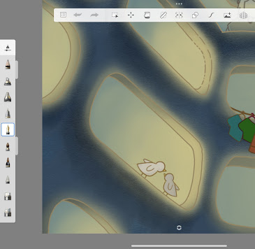
Back to where I stuck at the beginning, I colour the light in each of the holes there.
Uhmm, seems really weird... probably the lighting problem?
Looks better but doesn't t fit the feeling of this composition, too futuristic.
quite beautiful yet appears too gloomy, a little false, and a sense of loneliness.
Probably not a lighting issue; yellow matches the mood of this picture.
Eh, looks quite nice now!! Colour the holes first.
Okay, this is nearly what I want.
(v) Holes
Honestly, I initially just simply drew a plant into a hole.
People in this type of old apartment often tie up a rope in front of their house for drying clothes, and in my memory, the rope is very fragile and quickly damaged since it needs to hold a lot of weight, so we always had to change it, it is very memorable because we will never see it in the new condo.
I remembered that the family on the same level like feeding birds as well. They used to have a lot of cages with birds inside, and those birds loved chipping every morning, which was REALLY bothersome yet memorable for the time being.
As you can see, the family at the next level has many plants and households there really enjoy raising many plants since they have very bright sunlight there and allow them to better raise their plants, while there are many old men whose interest is to plant flowers.
My mother used to sing a song to me when I was a kid called 《蜗牛》, which means "snail." And the lyrics are about how a positive snail wants to successfully pass through all the hard and terrible after leaving her home, going to the outside world, climbing up to any plants, to find a better her, and develop to a higher level. Because this is a really uplifting song, my mother would always sing it to me.
I therefore, draw a large snail to symbolise my mother and a little nail to represent me, as this is how she teaches me to be strong as I get older.
I decided to draw two birds for the next level's hole, although with no real symbolism, merely since the buildings there always have a lot of crows and birds.
After all, I drew some grass or flowers to improve the visual quality and prevent it from being too empty.
(vi) My mum (in the middle)
Still referring to the same picture of my mum, using the same way to colour the hair as well as the face. And I use green colour to contrast the building and the person.
I made a mean face out of my mother's facial gestures 😡 since she is often really mean when she tells me to be careful when playing.
(vii) Font
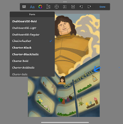
The font "be careful, see phing" is a crucial part in this scene and I can't make it too serious to elicit feelings of caring while still eliciting feelings of command. As a result, I'm looking for a variety of font patterns to better represent the emotions.
I chose to split the words, and they do not have to be straight, as I believe this is excessively restrictive.
The Chalkduster font has a problem in that it is a bit translucent, and having too much roughness leads in more null. As a result, I placed a shadow behind each font.
Until this, my first outcome has born.
(h) First outcome:
(i) Receiving feedbacks #2
After finishing this, I immediately present it to Dr. Charles for any comments and feedback, as I only have two to three days to make any adjustments.
He offered me a lot of comments, but the primary changes he suggested were:
- Maybe you can enlarged the person, you, in the middle there a little bit more and big.
- You could add more elements at the bottom there but that is not really the main point so I'll leave it to you, you can decide that.
(j) Improvement
- Little mum
Among these suggestions, what terrifies me the most is that Dr. Charles assumed the person in the midst of the work was me, but in reality, it is my mother, since this is my perspective when I look at my mother. Which, in my opinion, is a really serious problem since if this is a misunderstanding, the entire job might be regarded a failure.
This is my initial drawing for my mum.
But I was thinking that there must be an easy method to show the connection between the little mother and the robot mother.
- Font
Even Dr. Charles said I could leave it as is, but I'd want to give it a shot to see if I can do a better job.
As I enlarged the small mum, the word "be" began to overlap the little mother's hair, so I moved it up a bit to ensure that all of the parts could be seen well.
And I shifted the word "Phing" to the left side a little since I believe it will create a feeling of balance (?)
But I'm worried that the font may draw attention away from the little mom in the centre, so I moved it to the right side a little.
And I've finally done with this work.
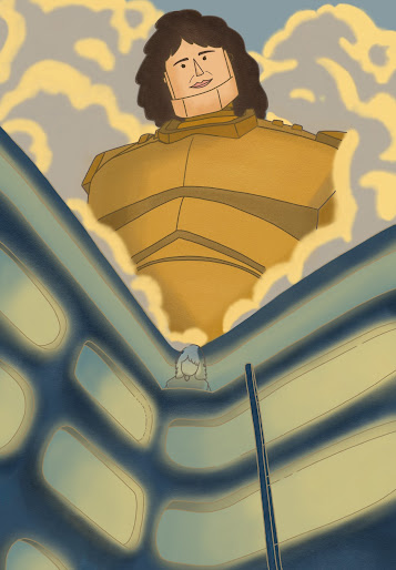
Final Outcome
Named: Say Careful! when you love me.
Rationale
This work's building is where I used to live as a kid and I spent my entire childhood here, but I've been moving away since I was 13 years old. That is why it is memorable to me because it brought back many memories for me, like playing with my peers, crying at the stair because my brother buli me, falling and breaking my teeth, etc. Among all of these, the most priceless moment is the one shown in this piece.
The angle of me drawing this work is the perspective when I look at my mum. whenever I was playing below on the ground floor, my mum would always stand in front of my house on level 4, looking down at me and reminding me to be careful while playing with a very mean face. As a result, my sense of this place is built on my mother, and I have the feeling that whenever I look up to my mother, she is always there, as if a huge robot is protecting me and providing me with a sense of security.
I've purposefully utilized many elements, colours, and etc in both an obvious and hidden way to elicit stories, feelings, and memories. For instance, I used orange as the robot mum's shirt to convey a sense of hope and stability, which can espress a positive vibe and sense of security; I secretly hide a love cloud behind the robot to express my mum is protecting me because she loves me; I chose not to use a high contrast colour to draw audiences' attention, such as black, because I wanted to elicit feelings of caring from my mum; and all of the plants and things that I put in the holes have their own story.
-
Main design principle
Hierarchy
The regulation of visual information in an arrangement or presentation to indicate significance is known as hierarchy. It has an impact on how the human eye interprets what it sees. In general, artists will utilize a scale or proportion that is out of proportion to convey the relative importance of the characters in their work.
Sub design principles
Principle of continuation: leads audiences' attention by following the continuous flowing elements in that direction until they come across another object.
Principle of proximity: describes the way relationships are formed between people or things close to one another
Contrast: Juxtaposition of strongly dissimilar elements
Balance: Fair distribution of visual weight in design work to create visual equilibrium
Emphasis: A point of interest
-
Feedback:
Specific for sketch 2:
Love the idea! I like the difference of scale and a good sense of hierarchy and dominance yet with a focal point. Keep going!
Specific for first and final outcome:
- Focal point
This is mostly due to your lens, and the sensation of magnification is there, but focus point also occurs at the same time, where the lines are also going towards the focal point, which is a very clever idea, as is the framing. And it is a nice balance since in terms of hierarchy, I prefer to transfer my eye to both you in the centre and your robot mother, that's a strong relationship between the two elements there.
- Font
You placed some interesting text there, but you have to put it in the most strategic spot, which doesn't have to be where you are, but it may be the third section for the audience to view. I also enjoy the spontaneous style in which you placed the font; it's just a matter of contrast (or am I overthinking?) Or, you can simply leave it as is. You have to tell me, you have to defend your work, you have to justify why this is the way it is.
- Building
I enjoy the things at the bottom and they are like your history/what is going on there every day. Good story here. You may add additional elements if you like, but please don't take attention away from yourself.
- Little mum
Whether you're doing it consciously or unconsciously, you're using a darker colour building and contrast yourself against a darker colour, save for the window, and that's why I spotted you. The proximity of the window or balcony is sufficient to distinguish oneself. The trick is to see if you can enlarge yourself a little bit further.
Additional feedback for my self-doubt:
My question: I'm not sure the outcome is good enough or not.
-
Reflection:
A lot of ideas, feelings, and thoughts about this project, both professional and personal.
I honestly find it embarrassing to be proud of my work whenever I see others' work that is 100 percent better than mine, I become insecure since I don't understand why I am proud when I can't even achieve the same level as the others. However, I believe this project has taught me an essential lesson: to embrace the flawed. If I only have a limited amount of time to do so, it is critical for me to recognize my own requirements and the highest level to which I am capable. Give up perfectionism, stop worrying, learn to satisfy with my work. For the time being, I think I've done my best to attain the highest level I'm capable of in this restricted amount of time and am satisfied with it.
Last but not least, "embrace the unavoidable agony." I'm well aware that the most significant challenge I'll have while working on these projects will be limited time. But since I can't avoid it or control it, why not embrace it, appreciate it, and attempt to learn from it? My takeaway from this problem is to train myself to complete all tasks since I will encounter it after venturing out into the outside world, which will be crueler and will not provide me with the extension time that Dr. Charles provides if I venture out into the outer world.
MOST IMPORTANTLY!!! I really feel happy as I look back on all my work because I think that I'm moving better and better, so proud of myself hehe.


Comments
Post a Comment